Dodo Pizza (in Russian Додо Пицца) is an IT-driven retail company that has set an ambitious goal: to build a global pizza chain based on unorthodox management practices and the principle of unprecedented transparency. In 2016, Dodo Pizza became the biggest pizza chain in Russia (in terms of quantity of pizzerias), leaving Domino’s and Papa John’s far behind. Now Dodo Pizza unites more than 240 pizza shops (corporate and franchise).
The design department contacted us with an ambitious task to develop a new logo for the company.
The word mark (dodo) was initially a key element of the identity of Dodo Pizza. Our task was to create lettering and to make it work together with the symbol. Apart from that we also proposed ideas for the new identity of the brand.

Starting point
Dodo Pizza rapidly grew into a large company. They wanted their new logo to appear more serious and more classy, referring to our typeface Chimera as catchy example, they wanted their letters to have a personality as well.

Initial logo of the company
The initial dodo was way too detailed to be used in smaller sizes. There were a few unsuccessful redesign attempts before. As a result they decided not to change the character of the bird dramatically. Already using a more simple cropped version of the bird for the icons, they chose to keep the original dodo with just minor corrections. But the main problem was that the new symbol did not work well with the old letters and did not give a right impression from the brand.

The first attempt in changing the lettering was already made by the Dodo design department. They put the letters from two lines into one. Which is what they had to do on the facades of the restaurants as well. The old logo used to have a mix of lowercase and uppercase letters. This did not stand out in a two-line composition, but it immediately became obvious when put in one line. These slanted letters felt too dynamic, too wobbly and too childish.

How should the new logo feel like?
In our first proposal for the lettering we tried three directions:
① dynamic, but almost upright:
we added asymmetric serifs to emphesize the dynamics; details: more spiky than rounded
② slanted, but squarish:
we kept the slant from the original logo (indicating the speed of the delivery), but made it look more serious by getting rid of the roundness; details: stencil (for a hand-crafted appearance)
③ friendly dynamic:
while keeping slant and roundness, we radically changed the proportions (still friendly, but a bit more serious)
What are the ways to combine the symbol with the lettering:
④ lettering around the symbol (Starbucks approach) — too generic
⑤ using the symbol as one of the O’s or using it as a separator between the two words — rejected
Results of the first meeting:
✕ printed and hand-made aesthetics does not suit the brand
✕ it is necessary to get rid of childishness, cartoonishness and make the logo more serious
✕ the forms should be sufficiently clean, without small details (without serifs)
✕ the letters themselves need to be more unique

Letters as key elements of the identity
In our second proposal we focused on trying out various constructions of the letters to find a personality:
The original logo tried to appear like an Italic, although it was not. What happens if we remove the childish roundness of the outlines, but use Italic constructions—which are generally more rounded. This could be a good compromise from the new logo. Within the Italic we tried different versions of the Cyrillic [д]. We suggested going for the more unusual one with an ascender. It could become a new distinctive element of the identity.
Client: ‘We don’t want to go that far from the existing logo’.

Letters as images
What if we are not focusing on the logo but more on creating a playful typographical identity around it?
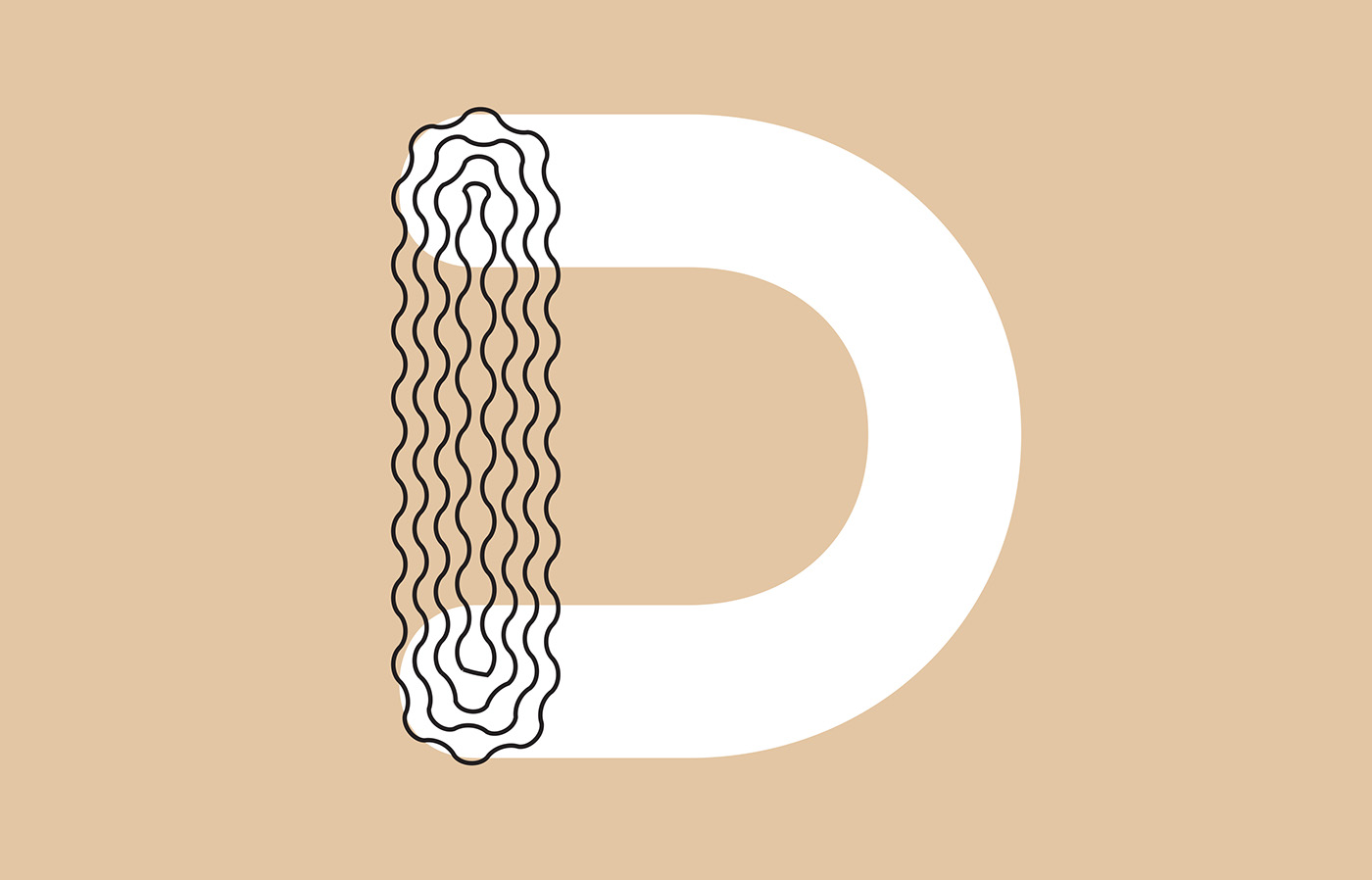
We developed a new flexible idea allowing endless possibilities of using letter shapes. A bold round typeface became our main module. These are the forms you can easily experiment with—you can use them as a pattern, as a frame, apply it to layers, etc. For each new season or event, a new story may be created, which will still be within the brand. You can change both the logo, and for example, the style of the typeface or the style of the layering. On one hand the letters still remain recognisable, on the other hand they already try to become an image.
And we got the YES from the client!


Based on the same structure we proposed another style of lettering. Still round, but more playful and unique. With the help of sharp cuts inside the letters. The letters are super bold but still readable.
Finalisations and simplification: killing our darlings
Our favourite was the bold funky lettering which you just saw above. Still we had to admit that it did not work together with the symbol (following image). After drawing the logo in both Light and Black we tried different combinations of them and chose the best one to fit with the symbol.
The abbreviation DODO was very important for the branding. That is the reason we have been discussing a lot whether Cyrillic and Latin versions of the logo should be used separately or DODO in Latin should be in both of them. At the end we convinced the client to have two versions of the logo—one in Cyrillic and one in Latin. Mixing scripts is not cool!


We chose the weight that works best with the symbol (the lightest). As a result the lettering ended up neutral. Though we are hoping that more playfulness will be happening in the identity in the future.

Contrast Foundry team:
Maria Doreuli, Katerina Kochkina, Liza Rasskazova
Dodo team:
Design Department: Jaroslav Mymrik, Mike Semyonov
Head of the marketing: Leonid Danschikov


